Building an app with map charts
Mapping features are a great way to visually present data to users of your web app, especially when the information is related to specific geographical locations. This tutorial will walk you through how to add interactive maps to your web app. We'll start from the basics of setting up, then move on to how you can show data on your map, and wrap up by adding some user interaction features.
If you're new to Genie, check the Reactive UI basics tutorial.
Plotting with PlotlyJS
To plot the map, we'll use the Plotly package in its base version provided by PlotlyBase.jl. This includes many types of visualizations and plots, all of which can be used in Genie app.
Plain PlotlyJS
A PlotlyJS plot is formed by two elements:
- Trace: holds the data that is displayed on a plot. For instance, the lines in a line plot, or dots in a scatter plot.
- Layout: sets the overall appearance of the plot, including the title, axis, and other properties.
Thus, to make a plot with Plotly you just need to generate some data and define the trace and layout. Here's an example of a minimal scatter plot:
using PlotlyBase

# Generate some data
x = 1:10
y = rand(10)

# Create a scatter plot trace from the data
trace = scatter(;x=x, y=y, mode="markers")

# Layout settings
layout = Layout(;title="A Simple Scatter Plot", xaxis=attr(title="X"), yaxis=attr(title="Y"))

# Plot the figure
Plot(trace, layout)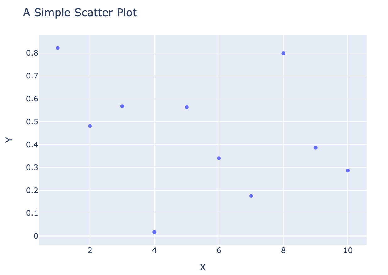
PlotlyJS with Genie
Plotting in Genie with PlotlyJS is straightforward: just define the trace and layout variables and expose them to the UI with @out. For example, the previous scatter plot example would become:
@app begin
    @out trace = [scatter(;x=x, y=y, mode="markers")]
    @out layout = Layout(;title="A Simple Scatter Plot",
            xaxis=attr(title="X"), yaxis=attr(title="Y"))
endThe only difference with the plain PlotlyJS example is that trace is a vector of traces.
In the HTML code, use the plotly component to display the plot:
<plotly :data="trace" :layout="layout"></plotly>There are many functions to generate traces, such as box, bar or histogram. Which one you use depends on the type of plot. See the PlotlyJS docs for a comprehensive list with examples.
Plotting a map chart in a Genie app
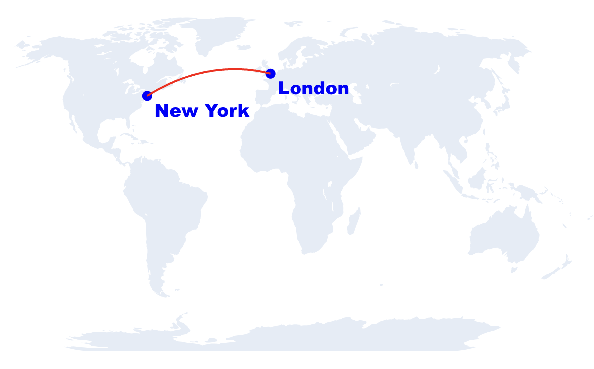
PlotlyJS provides a variety of map charts for visualizing geographical data. To showcase its use, we'll see how to implement the traces and layout to obtain a plot like this:
Map plot trace
For map charts, the scattergeo function takes a list of coordinates and draws a scatter plot on top of a geographical map. This is the code to generate a trace that plots the positions of London and New York on a map:
@out trace = [scattergeo(
    locationmode="ISO-3",
    lon=[-0.12, -74],
    lat=[51.50, 40.71],
    text=["London", "New York"],
    textposition="bottom right",
    textfont=attr(family="Arial Black", size=18, color="blue"),
    mode="markers+text",
    marker=attr(size=10, color="blue"),
    name="Cities"
)]Besides the list of points to be drawn, scattergeo can also add text to the markers and set other styling options with the text, textfont, mode, and other parameters. Notice the use of the attr function, which generates a struct of type PlotAttributes with the specified options. This struct is analogous to the dict used in the Javascript and Python versions of PlotlyJS to style markers and other elements.
It is also possible to draw lines on the map by setting the mode parameter to "lines". To have a line connecting London to New York, add a second trace to the list as
    @out trace = [
        scattergeo(
            # data for first trace
        ),
        scattergeo(
            locationmode="ISO-3",
            lon=[-0.12, -74],
            lat=[51.50, 40.71],
            mode="lines",
            line=attr(width=2, color="red"),
            name="Route"
)]See here for a comprehensive list of parameters for scattergeo.
Map plot layout
To set the layout, use the PlotlyBase.Layout function with the package namespace as a prefix to avoid clashes with the Layout struct exported by GenieFramework. Besides the usual title and showlegend options, this function can take a geo parameter in which you can set additional styling for the map:
@out layout = PlotlyBase.Layout(
    title = "World Map",
    showlegend = false,
    geo = attr(
        showframe = false,
        showcoastlines = false,
projection = attr(type = "natural earth")))See the PlotlyJS docs for more details on the available parameters for geo.
Final map chart plot
This is the complete code for app.jl and app.jl.html to implement the map chart in a Genie app:
module App
using PlotlyBase
using GenieFramework
@genietools

@app begin
    @out trace = [
        scattergeo(
            locationmode="ISO-3",
            lon=[-0.12, -74],
            lat=[51.50, 40.71],
            text=["London", "New York"],
            textposition="bottom right",
            textfont=attr(family="Arial Black", size=18, color="blue"),
            mode="markers+text",
            marker=attr(size=10, color="blue"),
            name="Cities"),
        scattergeo(
            locationmode="ISO-3",
            lon=[-0.12, -74],
            lat=[51.50, 40.71],
            mode="lines",
            line=attr(width=2, color="red"),
            name="Route")
                 ]
    @out layout = PlotlyBase.Layout(
            title = "World Map",
            showlegend = false,
            geo = attr(
                showframe = false,
                showcoastlines = false,
                projection = attr(type = "natural earth")
            ))
    @in data_click = Dict{String, Any}()  # data from map click event
    @in data_cursor = Dict{String, Any}()

    @onchange data_click begin
        @show data_click
        @show data_cursor
    end
end

@mounted watchplots()

@page("/", "app.jl.html")
endCapturing map click coordinates
To capture click events on a plot, use the @mounted watchplots() instruction. This will execute watchplots() when the page is loaded, which will generate the code and dictionary variables in the front end to capture click events. The name of these dictionaries and the information they capture is is:
data_click: click events.data_hover: mouse move events.data_layout: layout changes such as scrolling.
To make these variables accessible from the Julia code, define an input variable with @in with the same name. Then, their contents can be watched with an @onchange block.
@in data_click = Dict{String, Any}()  # data from map click event

@onchange data_click begin
    @show data_click
endThis code will output data_click to the REPL when a click is detected, showing that it contains the lat and lon coordinates at the clicked point:
data_click = Dict{String, Any}("cursor" => Dict{String, Any}(
"lat" => 5.241635130123061, "lon" => 28.427974278067687))Finally, this is the complete code for a Genie app with an interactive map chart:
module App
using PlotlyBase
using GenieFramework
@genietools

@app begin
    @out trace = [
        scattergeo(
            locationmode="ISO-3",
            lon=[-0.12, -74],
            lat=[51.50, 40.71],
            text=["London", "New York"],
            textposition="bottom right",
            textfont=attr(family="Arial Black", size=18, color="blue"),
            mode="markers+text",
            marker=attr(size=10, color="blue"),
            name="Cities"),
        scattergeo(
            locationmode="ISO-3",
            lon=[-0.12, -74],
            lat=[51.50, 40.71],
            mode="lines",
            line=attr(width=2, color="red"),
            name="Route")
                 ]
    @out layout = PlotlyBase.Layout(
            title = "World Map",
            showlegend = false,
            geo = attr(
                showframe = false,
                showcoastlines = false,
                projection = attr(type = "natural earth")
            ))
    @in data_click = Dict{String, Any}()  # data from map click event
    @in data_cursor = Dict{String, Any}()

    @onchange data_click begin
        @show data_click
        @show data_cursor
    end
end

@mounted watchplots()

@page("/", "app.jl.html")
end